Pictography: a visual language that needs no words
Pictography originated on the rock walls of caves and open-air rock shelters during the Upper Palaeolithic, long before the emergence of writing. To communicate, prehistoric humans used iconic symbols that represented ideas, feelings, events and objects through images filled with meaning.
Pictography thus became a visual communication system based on pictograms. From a semiotic perspective, a pictogram is defined as a symbol that conveys a concept or piece of information through an easily recognisable graphic representation.

Over time, pictograms have evolved to adapt to new contexts and needs. Today, they continue to be used as a form of artistic expression and form part of wayfinding, signage, public information and visual identity systems.
Pioneers and leading figures who explain the world through pictograms
The creator of the ISOTYPE system was not a graphic artist. Otto Neurath was an Austrian economist, sociologist and philosopher. His aim was to solve a very specific problem: to make complex economic, social and statistical data easy to understand, regardless of the viewer’s educational level or language.
Otto Neurath understood the content, but he was not a specialist in visual representation. In 1925, he began assembling a team together with Gerd Arntz, a graphic artist and pictogram designer, and Marie Neurath, a mathematician and educator.
This work gave rise to ISOTYPE — International System of Typographic Picture Education — officially introduced in 1935. ISOTYPE was not simply a collection of pictograms, but the first structured system of universal visual communication.
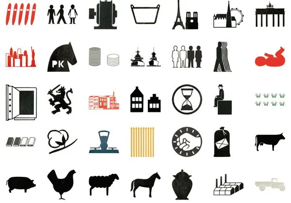
Beyond their informative function, pictograms have also become a versatile artistic resource.
A notable example is Yang Liu, a designer and illustrator known for her publications with Taschen. Dubbed the “Queen of Pictograms”, she uses minimalist pictograms to offer social commentary on cultural differences, habits and everyday behaviours in contemporary society.

The creative possibilities of pictograms are virtually limitless. Their use extends to art, illustration, editorial design, visual communication and urban interventions.
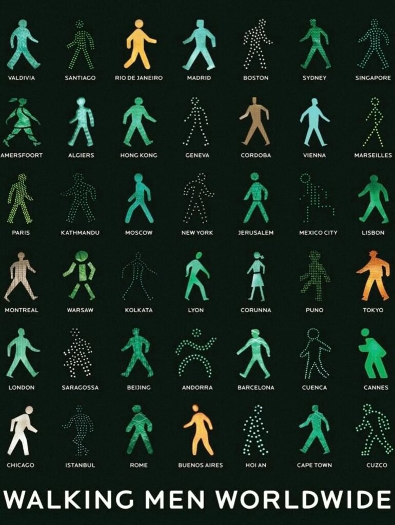
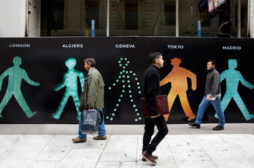
Some projects explore the graphic diversity of pictograms used in public signage. One example is WALKING MEN WORLDWIDE, a visual journey through cities around the world using pedestrian pictograms.
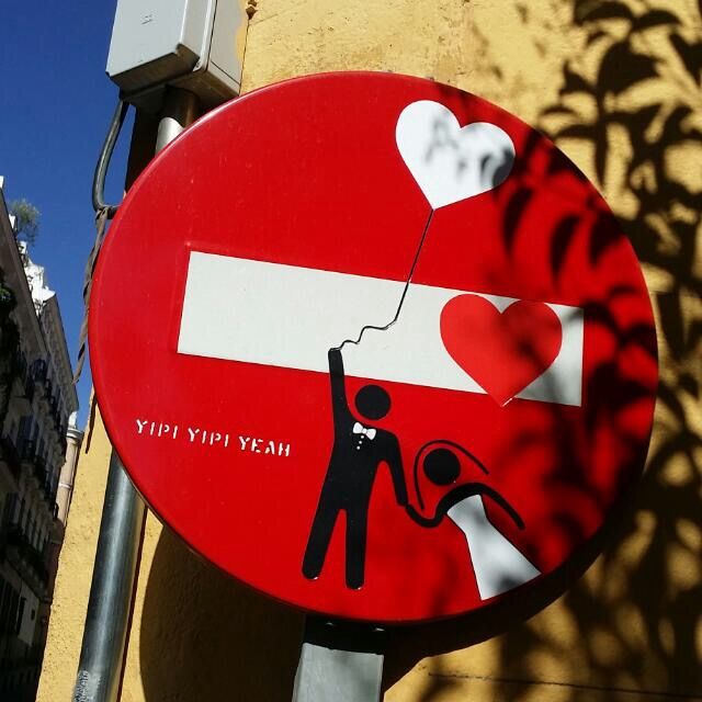
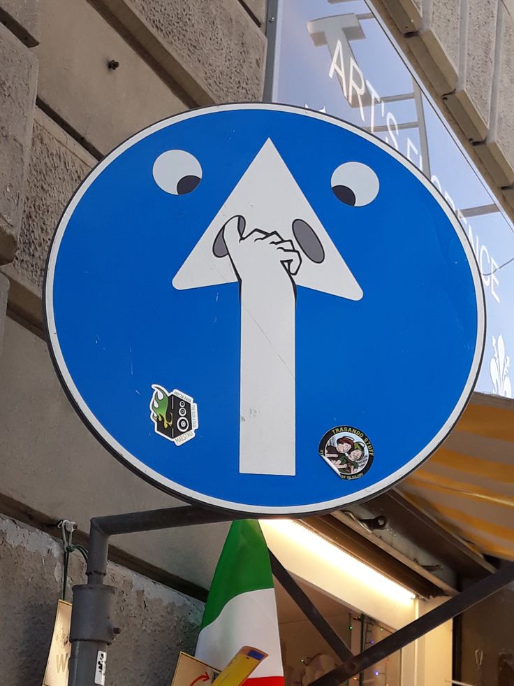
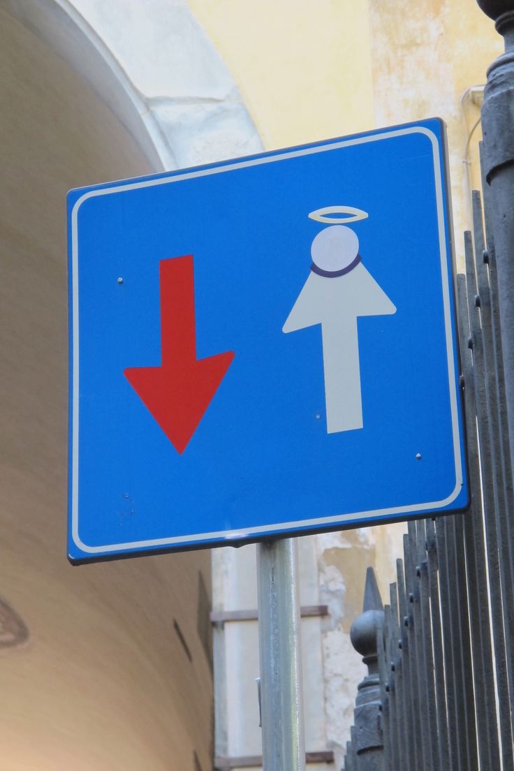
Similarly, interventions can be found in different cities that reinterpret traffic signs and other urban symbols, transforming everyday elements into urban art.
Pictograms in sport
The pictograms used at the 1936 Berlin Olympic Games, although the first to be employed systematically in a sporting context, were not the best known. The true turning point came with the 1964 Tokyo Olympic Games, where a large-scale pictogram system was introduced.
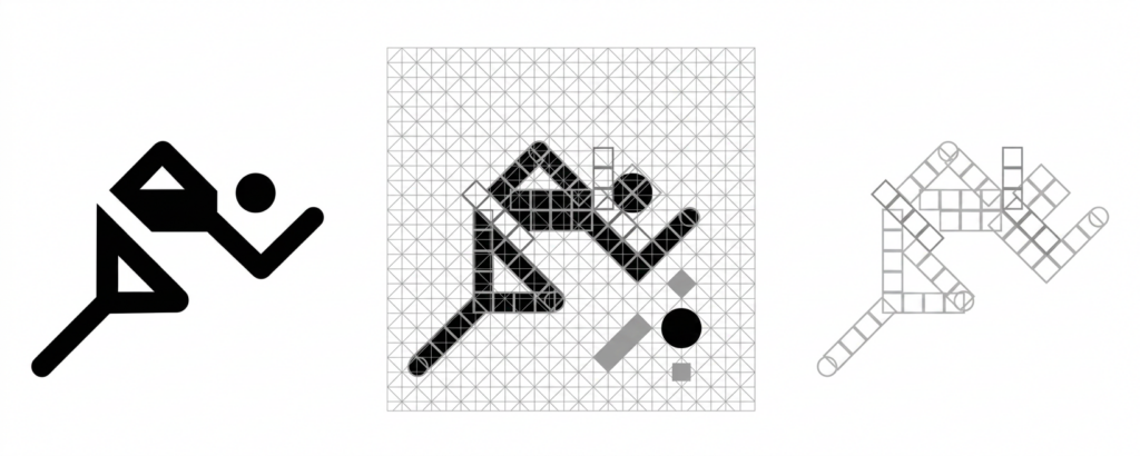
The consolidation of the modern pictographic language took place at the 1972 Munich Olympic Games through the work of designer Otl Aicher. His series of full-body stick figures, constructed using 45° and 90° angles, laid the foundations for many of the pictograms we recognise today.
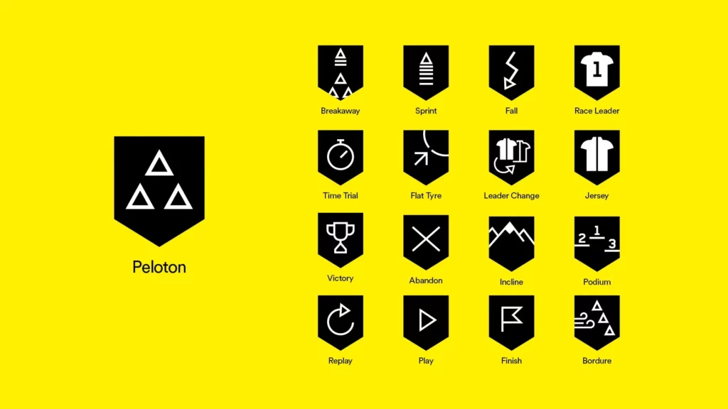
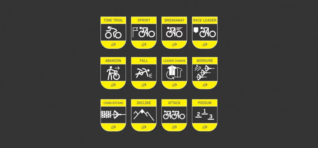
In 2018, Eurosport commissioned the London-based agency DixonBaxi to develop the visual identity for Home of Cycling, the graphic system that unified its entire cycling coverage, including the Tour de France, the Giro d’Italia, La Vuelta a España and more than one hundred international competitions.
As part of this visual communication system, the agency designed an extensive collection of pictograms intended mainly for television broadcasts and digital platforms, adapting them to new communication media.
Pictograms [almost] as famous as their logos
Can brands be recognised without being named?
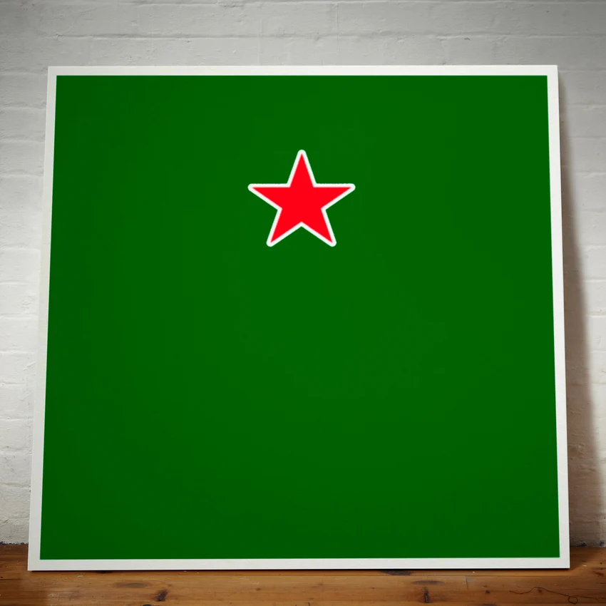
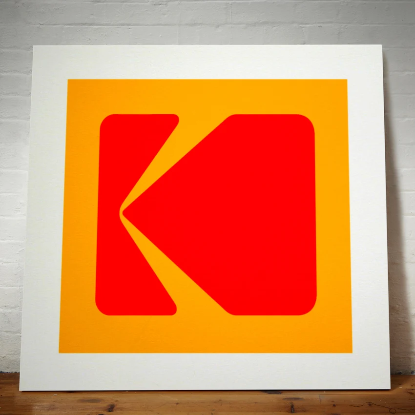
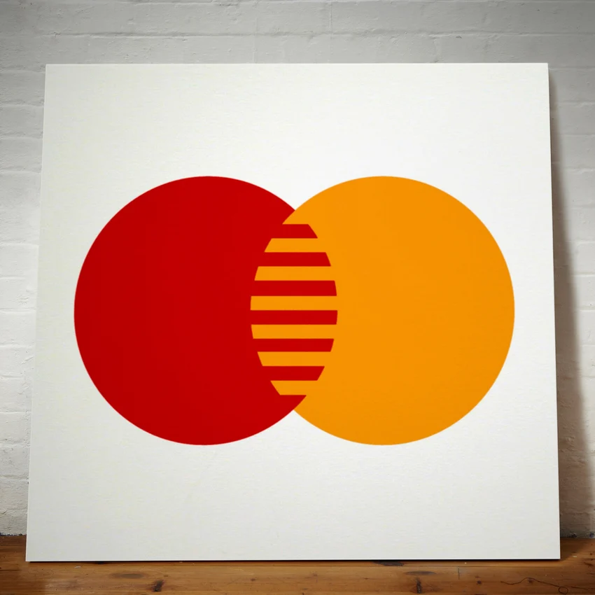
The creatives at We Are Dorothy decided to put this to the test. To do so, they developed a project featuring pictograms based on the logos of well-known brands.
In the images, we can easily recognise pictograms of famous brands without their names. Their logo or typography does not even appear. Even so, we are able to identify them almost immediately.
This exercise demonstrates the enormous communicative power of a well-designed pictogram.


Pictorial symbols vs pictograms
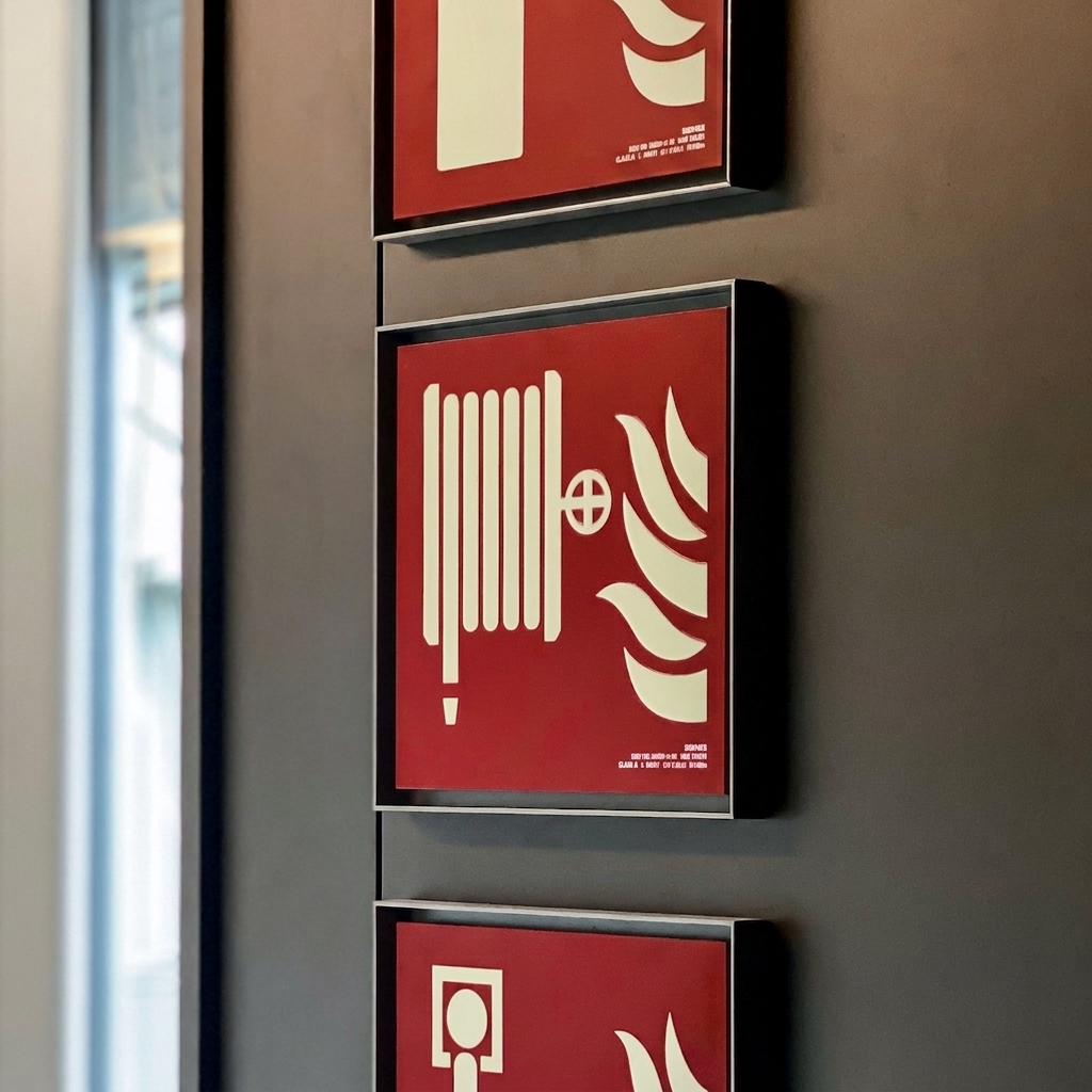
Pictograms may be freely designed for artistic, informative or commercial purposes. However, when their design, shape, colour and meaning are regulated by a technical standard, they are referred to as pictorial symbols.
Their main purpose is to ensure that the same message is understood immediately and universally, regardless of language or country.
In the field of emergency signage, the use of standardised ISO 7010 symbols not only promotes universal communication, but is also a regulatory requirement in most countries. Their application ensures that people can quickly identify evacuation routes, fire protection equipment and the actions they must take in an emergency.
Related posts we recommend: