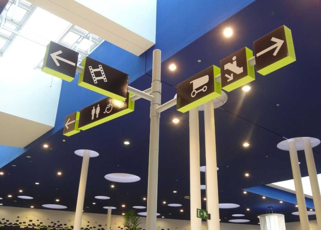
In a wayfinding project we have two key elements: arrows and pictograms. We can also add typography, color and materials as essential components of effective signage.
If the signage of a place were a recipe, the first and one of the most important ingredients would be the arrows, since they solve most of the communicative needs.
Arrows are considered a universal communication symbol and for our projects they are a key element, they allow us to reduce visual noise by grouping directions and generate effective personnel flows.
For its design we always take into account the contrast of colors so that it is clearly visible to the user. This use of colors and the shape of the arrow itself allows us to turn it into another branding element, turning all signage elements into an extension of the brand.
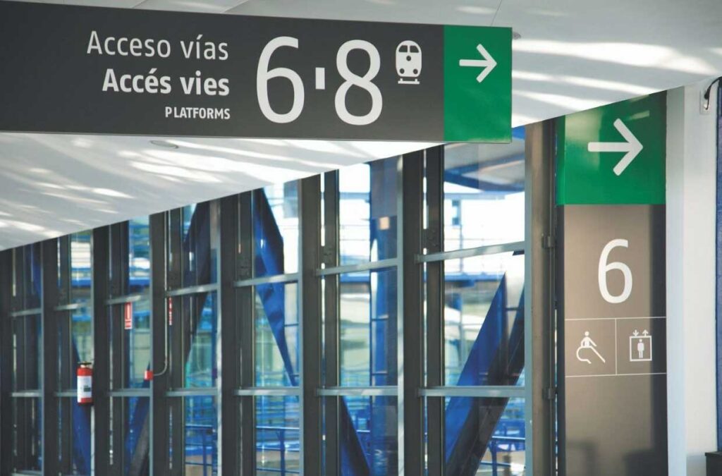
One of the most common mistakes in the use of arrows is to put them pointing to the text, or to put the text between the arrow and the target, this can create confusion to the user.
In order to make the message more effective, we usually place the arrows in the same block of information and the texts in a different one, so that the information is very visual and the message we send is easy to read.