Adding more signs does not solve orientation problems.
Signs are a physical communication element. They contain information, but on their own they do not guarantee that people will find their destination. Without a strategy based on users’ needs and the organisation’s objectives, even spaces with extensive signage can become confusing.
Discover why people get lost in buildings full of signs and how to avoid it to ensure intuitive, seamless and independent navigation.
Confusing Signage: Mistakes That Make Orientation More Difficult
1. Designing signs without a strategy
This is probably the most common—and the most harmful—mistake.
The strategic phase of wayfinding consists of analysing the space and its surroundings, the users and their needs, the different circulation routes and the organisation’s objectives.
Understanding these factors makes it possible to establish a coherent, user-centred orientation system before designing any physical signage.
2. Thinking about signs before routes: decision points
Signs should not be placed where they are most convenient or aesthetically pleasing, but where they help people make decisions.
Designing signs before understanding users’ routes often results in unintuitive systems where information arrives too early, too late or goes unnoticed.
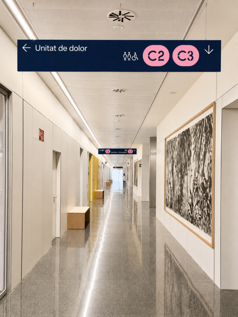
Decision points are the places where users need to make a choice.
At Hospital del Mar, the signage system has been strategically distributed around these key points to help people select the appropriate route to their destination.
3. Designing for architecture instead of people
A hospital, hotel, airport or office accommodates very different types of users. Moreover, in any of these environments, occasional visitors require different information from regular staff.
If signage is not adapted to users’ familiarity with the environment, the information will be insufficient for some and excessive for others.
4. Including too much information or unnecessary content on a sign
Many organisations believe that adding more information will solve orientation problems. In reality, placing more signs at a complex decision point creates cognitive overload and makes it harder for people to make quick decisions.
Identifying the information users actually need helps simplify the message, improve understanding and resolve orientation issues more effectively.
5. Neglecting emergency signage
It often remains unchanged for years despite changes in layouts, building uses or regulations. Reviewing emergency signage enhances safety, improves effectiveness in critical situations and ensures regulatory compliance.
👉 Recommended article: Emergency Signage: An Updated Checklist to Ensure Regulatory Compliance.
6. Failing to update signage when the space changes
Buildings constantly evolve: new services, departmental changes, renovations and new access points all transform the way people use them.
These changes significantly affect both users’ needs and the diversity of people using the space. Football stadiums are a good example, having evolved into multifunctional entertainment venues. These new venues require bespoke wayfinding systems capable of guiding a wide variety of users, from concert audiences to journalists, corporate event guests and hospitality visitors.
7. Overlooking accessibility
A truly accessible signage system must respond to the needs of a wide range of users, considering aspects such as legibility, contrast, sign placement and tactile systems.
8. Treating signage as something separate from architecture
Signage is part of the spatial experience.
When introduced without architectural consideration, it can disrupt the design of the space and reduce its perceived quality.
9. Neglecting brand consistency
Materials, colours, typography and visual language all contribute to reinforcing brand identity.
A signage system aligned with the brand defines its personality, enhances the user experience and helps make the environment more recognisable and memorable.
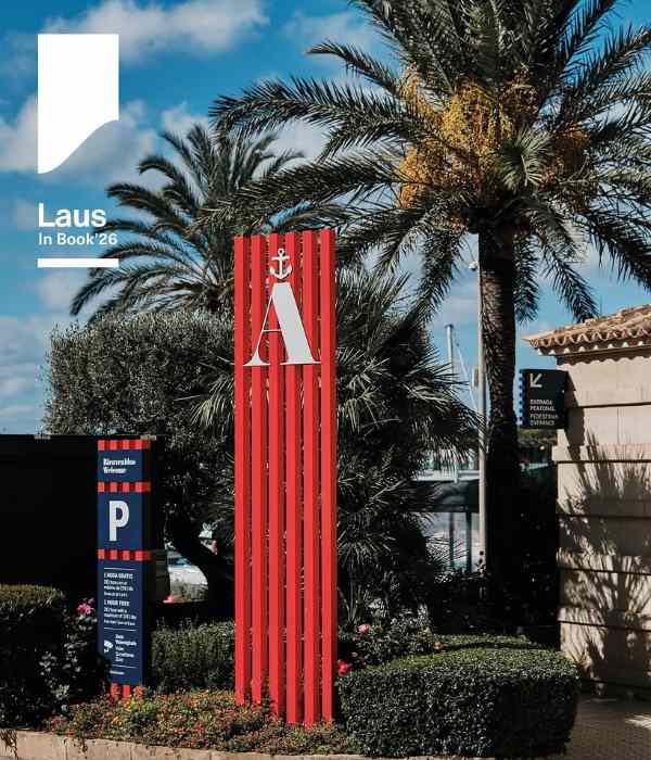
Port Adriano (Mallorca), designed by Philippe Starck, is one of the most modern marinas in the Mediterranean. The signage project, shortlisted for the 2026 ADG Laus Awards, integrates naturally into the environment, respecting its materials, scale and visual language.
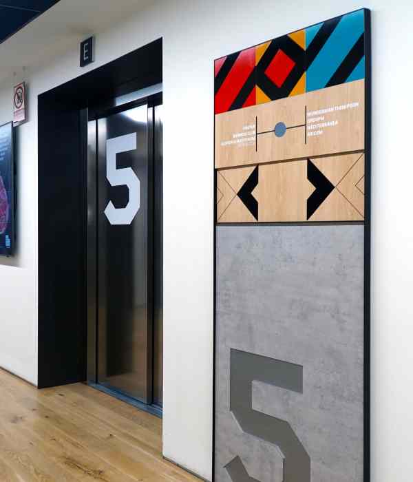
The combination of materials and different manufacturing techniques enabled us to recreate the appearance of construction materials without actually using them. The result is a harmonious integration with the identity of WPP La Matriz Campus, Madrid.
10. Assuming one signage model works for every building
Every space has its own specific needs.
There are no universal solutions for hospitals, hotels, offices, shopping centres or sports venues.
Likewise, not every building requires the same Wayfinding Design approach.
How to Know Whether Your Space Needs a Wayfinding System
A Wayfinding system can be designed and implemented in spaces of any size. However, it is particularly recommended when one or more of the following situations apply:
- You want to provide a more intuitive and memorable user experience.
- You want to reduce staff enquiries and improve operational efficiency.
- People’s safety is a priority.
- You want to reduce staff enquiries and improve operational efficiency.
- You want to strengthen your brand identity through the spatial experience.
- The building or architectural complex is large or complex, with multiple routes or decision points.
- The space is used by diverse user groups with different needs.
- Visitor numbers are high and continuous, including at night, as in hospitals.
- The space changes frequently through new services, renovations, changes of use or extensions.
- Signage is already in place, yet users still become disoriented or regularly ask for directions.
If you identify with several of these situations, your organisation is likely to benefit from a wayfinding strategy. Contact our team and tell us about your project.