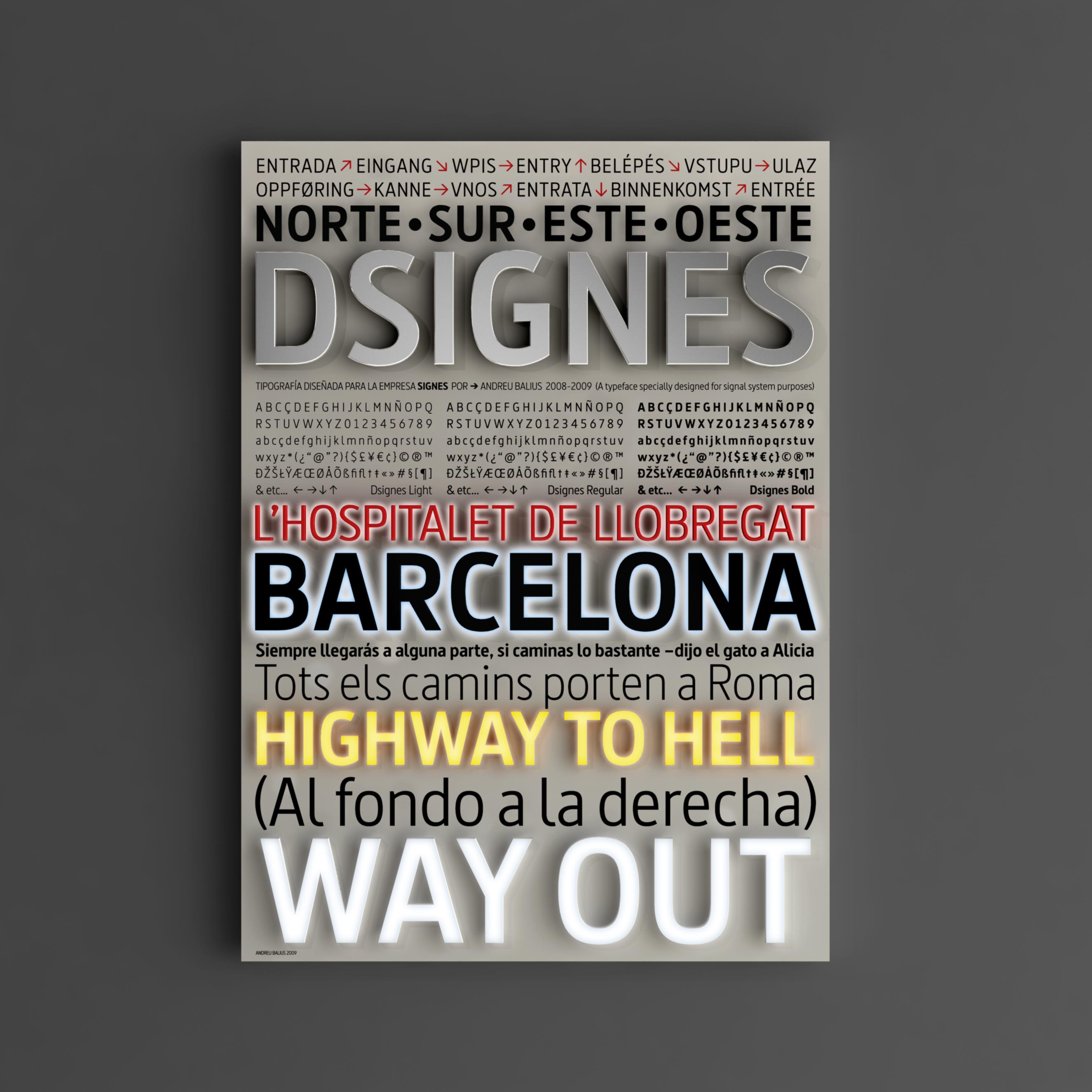
DSIGNES Typography
DSIGNES Typography
We have dared to take on the most difficult aspect – the typography. Because it is essential in any graphic project.
Along with Andreu Balius, one of the most renowned experts in the field, we have developed a typographic family specially designed for its application in signage projects.
We call it DSIGNES. It has three declinations — Light, Regular and Bold. We are very happy to be able to offer it to designers and architects so that they may make good use of it.
You can request it at: latipodsignes@signes.es
Don’t even think twice about it – it’s free!
The DSIGNES typography has won the following awards:
– 2010: European Design Award
– 2009: Letra Award (National awards for visual communication and environment graphics) in the ‘Miscellaneous’ category


